
(2200 words)
It is difficult to get a man to understand something, when his salary depends on his not understanding it.
Upton Sinclair
Part 1 of this series can be found here: What is the carbon bubble?
Part 2 can be found here: Why might it happen?
In the previous two posts, we looked at the reasons why some analysts worry that a bubble might be emerging in the valuation of fossil energy companies, particularly those companies that have developed no plans to compete in a low-carbon world. As before, my goal here is not to argue for or against the idea of a carbon bubble, since financial market analysis is well outside my domain of expertise. Instead, my goal is to summarize the reasoning and the evidence, as I understand them because if there is a bubble developing, and it pops, we will all feel the pain.
With that caveat out of the way, let’s now ask: If a carbon bubble is in fact emerging in the global energy markets, how big is it? Though the numbers I’ve found from various sources show a wide range, depending upon the methodology used, it’s safe to say that it’s in the trillions of dollars. Let’s see where numbers like that come from.
I focus on the example of oil below, but similar considerations apply for coal or natural gas. Some argue that the one winner in the fossil energy world in coming decades could be natural gas, because it produces fewer greenhouse gas emissions, while also burning cleaner and with less negative environmental impacts than either coal or oil. This is controversial because we still need to keep in mind the long-term goal of becoming carbon neutral, and even carbon negative, but a switch to natural gas might buy some time while zero- or negative-emission technologies are (hopefully) developed at industrial scales.
Consider what’s meant by the ‘proven reserves’ of a fossil energy company. The term ‘proven reserves’ does not mean ‘how much is physically down there’. That’s called the ‘in-place’ or ‘ultimately recoverable’ estimate. Just knowing how much oil or coal has been identified in a field doesn’t help an investor decide how valuable it might be. There are two further considerations: the technological feasibility of bringing it to the surface, and the economic feasibility of bringing it to market.
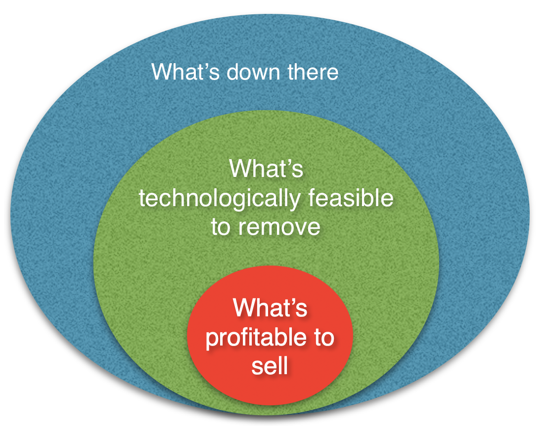
For publicly-traded firms, a fossil fuel company’s stock price reflects a belief by investors that their proven reserves will be brought to market and sold at a profit. This is the heart of the matter.
BP estimates, based upon data collected by the US Energy Information Agency, and OPEC numbers, that we currently have about fifty years worth of proven reserves if we use them at our current ‘burn rate’. But, if we burn all of those reserves we will overshoot our CO2 emissions targets in the Paris Agreement by a wide margin.
So, this leads to the question: what is the market value of the proven reserves that would have to be left in the ground if we are to meet the targets?
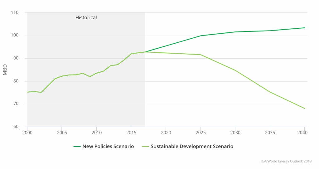
We saw this plot already in both Parts 1 & 2. It shows two baseline projections for future oil production (in millions of barrels per day), taken from the International Energy Agency’s World Energy Outlook, using two scenarios. As a reminder:
New Policies Scenario (NPS)
World Energy Outlook, IEA
Incorporates existing energy policies as well as an assessment of the results likely to stem from the implementation of announced policy intentions.
Sustainable Development Scenario (SDS)
Outlines an integrated approach to achieving internationally agreed objectives on climate change, air quality and universal access to modern energy.
Notice that the NPS largely assumes a ‘steady on’ approach, with no large changes in direction, while the SDS specifically aims to meet climate objectives, while spreading the benefits of the necessary technology transition as widely as possible. Both scenarios assume steady growth in the world economy. They just make very different assumptions about how that economy powers and feeds itself.
The NPS suggests world oil production still has a lot of headroom left for increase, while if the SDS proves to be a more accurate projection, it suggests that we’ve reached ‘peak oil’. The difference is critical, because if the SDS is the path the world takes going forward, a lot of oil is going to be left underground. Some of those proven reserves will become, in effect, stranded assets. In July of 2020, BP and Shell both ‘wrote down’ the value of their reserves and projected future revenues from them, arguing that future demand is likely to decline from earlier estimates.
This is why some writers like Mike Berners-Lee and Duncan Clark have argued that the current market value of proven reserves is the single largest impediment toward meaningful action on climate change.
How big would the ‘pop’ be?
From the IEA plot above, it’s easy to estimate the difference in oil production between those two scenarios: the area of the wedge out to 2040 is over 100 billion barrels of oil. At current market rates, that translates to almost $10 trillion dollars. The value of this commodity is no abstract thing: it’s factored into the stock valuation of oil companies, or their bond ratings. What happens to those valuations if the world chooses the downward sloping path in the IEA plot above?
It’s not unlike owning a large mansion with several wings, one you bought with a mortgage, secured by the assumption you could pay for it by renting out most of the rooms. Now you discover that one room after another is becoming unusable. Suppose a growing sink hole is swallowing them up. This causes a slow but steady decline in your rental income. Of course the market value of the property will drop, but it doesn’t necessarily happen smoothly, even though the physical size of the sink hole grows gradually. What looks like a slow decline in the ‘real’ property usability can lead to a rapid collapse in your relations with your banker. Suppose you had other investors who loaned you money to launch your venture. When do they demand their money back? Human crowd psychology now comes into the picture.
Similarly, even under the IEA SDS in the plot above, oil production has a graceful decline. Worries about a possible ‘pop’ of a carbon bubble aren’t concerned with that decadal time scale of changes in production, but instead reflect concerns that markets might suddenly switch their likelihood estimates of which of the two IEA scenarios will play out. If investors believe the lower production projections are becoming more likely, it really doesn’t matter whether that shift in risk estimates is due to updated estimates of the timescale for technological disruptions, or the adoption of more aggressive climate policies around the world. It only matters that projections of future oil revenues go down and, unless the company in question has developed a plan to compete in a low-carbon world, oil stocks become less attractive as a long-term investment.
Looking further out in time, and beyond oil to all fossil energy sources, in a 2015 study, Energy Darwinism II: Why a low-carbon future doesn’t have to cost the Earth, CitiBank estimated that the move to a low-carbon world will strand about $100 trillion in unburnable fossil fuel assets out to 2050. A generation ago, when policymakers and investors saw numbers like that, they saw only the costs involved, their hearts quailed and their knees went wobbly. As a result we lost decades of valuable time when we could have made more progress. But, CitiBank now projects that by transitioning to renewables aggressively, while investing in R&D, energy efficiency and infrastructure upgrades, the overall effect on the global economic output by mid-century can be surprisingly small, perhaps even positive in some scenarios.
The public mood has shifted now, the science is even more clear, and we also know that for decades the public discourse was polluted by disinformation injected into the information stream for political and/or economic gain, some of it by people who claimed to believe that climate change was a ‘plot’ to destroy capitalism. The irony is that a true believer in market capitalism would fight to make good information available, so the magic hand of the market can do its magical thing.
Meanwhile, activist investor groups like Climate Action 100+, which includes over $32 trillion in assets managed by its members, have now signed pledges committing to push for more climate-related financial disclosures and accountability from the companies they invest in, and they threaten to divest if they are not satisfied.
Now, hopefully, we won’t get fooled again, and when people like investment bankers or pension fund managers hear such big numbers about stranded assets they take a deep breath, pull up their socks, and conclude that if a fossil energy company doesn’t have a climate action plan, perhaps investors should put their long-term money somewhere else.
How times have changed.
Who currently owns the stocks and bonds of publicly traded fossil fuel companies? Institutional investors, such as pension funds, university endowments, and even mutual funds, where many have put their life savings, are a large part of the story here. But a very big player are the sovereign wealth funds, like the Norwegian and Saudi investment funds, built up over many years by profits from the sale of fossil fuels. The fact that many of the owners of fossil fuel stocks are institutional investors reflects the reality that for many years fossil fuel companies were considered a solid investment, paying regular dividends, and a safe place to put money. Even though the price of oil on the spot market might fluctuate wildly, the companies were profitable, paying steady dividends to shareholders, and they were therefore popular with large institutional investors.
The Norwegian and Saudi sovereign wealth funds together control trillions in assets, and they have both now decided to no longer invest in new fossil fuel projects, and to divest from oil companies that have no plans to diversify into renewables. They also aim to invest aggressively in renewable energy projects. In addition, Norway’s ruling Labor Party recently decided not to support drilling in the Lofoten Islands, potentially leaving a billion barrels of oil untapped as a result.
But asking who owns the stock is not the same as asking who would suffer if a carbon bubble pops. In the 2008 financial crisis, it wasn’t just those who held securitized mortgages who suffered from a collapse in that market, but everyone else, because that’s how interdependent the global financial system has become.
The rapidity of the coming shift toward a low-carbon economy is where a possible ‘carbon bubble’ comes in. The willingness to invest might be changing as analysts begin to understand the risks associated with continuing to hold fossil fuel stocks or bonds. National oil companies are not immune from a low-carbon transition either. Even though they don’t sell stock, they often have to borrow to mount large development projects, and countries that nationalized their oil production in past decades have come to depend upon those revenue streams for their national budgets. The details are different, but the underlying risk exposure is the same: a possible coming drop in demand over the next few decades for fossil fuels if renewables and electrified transportation are really poised to take off, and if policies are put in place that adds further political impetus to the transition.
The more optimistic analyses I summarized in Part 2 argue that even without policy actions pushing things toward decarbonization, technological disruptions are underway that will make it happen. This makes it sound too easy, however. Without forward-looking policies in place, the changes won’t happen as quickly as they might otherwise, nor will they proceed with the safety nets in place to assist those harmed by the coming social transitions. Our current political turmoil is due, at least in part, to people who felt direct harm from the crash of 2008 and the ensuing long decade of recovery. The impacts of the current pandemic have also been unevenly distributed, and the economy will take years to recover. Many lost their homes, or their hopes for a college education for their children, and those lost years can never be returned to them. Imagine what will happen if there is an even bigger disruption to the world economy. Visionary leadership is called for that has been lacking to date, leadership that doesn’t promise a return to a past that is long gone, or one that relies on cynical promises to rebuild industries that can no longer compete, but instead real leadership that instills a sense of hope that we can in fact build a better future by moving forward.
These trends show why it’s possible for someone like me to be frustrated with the short-term political paralysis in Washington, nervous about the coming changes, while at the same time cautiously optimistic longer-term. Things are starting to move in the right direction, and the pace of change is likely to accelerate in coming years. We now have real choices, good choices, for moving away from fossil fuels and building a more sustainable civilization. What is certain is that we are on the cusp of great changes. Will it happen soon enough to avoid some of the worst effects of climate change? Will we follow our better angels and try harder to make sure that no one is left behind? Time will tell.
Part 1: What is the carbon bubble?
Part 3: How big would it be, and who would get hurt if it popped? [current post]
Further sources:
In addition to the linked sources, I found the following readings or infographics useful for this part:
[Rudebusch] Rudebusch, Glenn D. “Climate change and the Federal Reserve,” Federal Reserve Bank of San Fransisco, Economics Letters, March 25, 2019. Accessed March 28, 2019.
[Visual Capitalist] Desjardins, Jeff. “All of the World’s Stock Exchanges by Size,” Visual Capitalist. Accessed March 28, 2019.
[World Bank] Stocks traded, total value (current US$). World Bank. World Federation of Exchanges Database. Accessed March 28, 2019.

The text is licensed under a Creative Commons Attribution-NoDerivatives 4.0 International License.

2 comments